Image Source: https://www.cheapwebdesign.co.uk/
1. Make Sure to Follow Facebook's Rules for Facebook Pages
Make sure you have Facebook guidelines bookmarked and review them before creating your Facebook cover. Breaking these rules can result in your whole Page being taken down - which would be a bit silly when you explain to your clients that you aren't able to advertise for them because of your Facebook cover photo. So know them and follow em!
2. Facebook Cover Photo Size: 820 Pixels Wide By 312 Pixels Tall On Desktop
So you spent an hour designing the perfect Facebook Cover Photo and then you go to upload it but your killer CTA line is cut off. Shucks! All of that could have been prevented by just getting the right dimensions.
If you upload an image smaller than 820 Pixels Wide By 312 Pixels, Facebook will stretch it to fit the right size which can distort your image and we don't want that.
If you want to avoid the hassle of resizing your cover photos you can just use one of these handy templates, and it's ready-set-go:
Canva FB Cover Photo Template
pre-sized template for Facebook cover
Poster My Wall FB Cover Template
To be honest, sometimes you just have to mess with it until the picture fits, if you aren't using the templates. For example, my ecommerce store cover photo fits perfectly but isn't the Facebook standard dimensions for cover photos, it's 2232 × 822:

3. Keep Your Cover Photo Visually Striking Not Busy
If you've ever seen a photo with a lot of things going on in it, you know that it's like a visual representation of a head ache. No one wants all that going on!
Keep that text concise, and images simple with clean lines and primary color contrasts. Use 1, maximum 2 info graphics. Here are few Facebook Cover Photos that really work:

Here you can see Uber has identified their target audience - consumers who need a driver, pointed out how they can book a driver with a smartphone image of their app, and created a visually striking contrast between the black and white colors.
The map grid in the background is almost a subtle unconscious influence to get you thinking about where you want to go using their ride share service.

Social Media Examiner is using their Facebook Cover photo to advertise their upcoming YouTube marketing summit. You have their summit's name just to the right, with brand colors present and kayakers symbolizing the teacher-student relationship - very well done!
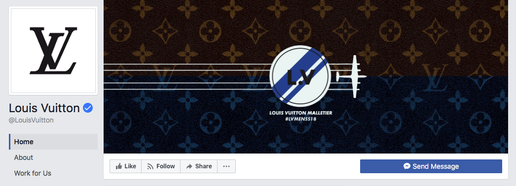
Last but not least, luxury brand Louis Vuitton has an elegant yet simple design of motion going from left to right as most people read, from an airplane that may symbolize a private jet from the upper echelons of the financial earners:
4. Keep Your Audience In Mind
You want to instantly strike a chord with your target audience, and while it's fun to get creative, don't get carried away. Keep your intentions in line with your brand colors and cover photo.
Social media accounts are extensions of your business - this is your digital store front. So you want a call to action, and a message to speak to your target audience.
5. Make Sure Your Cover Photo is Mobile-Friendly
Look at any metrics for ads and you'll see more and more people are viewing Facebook ads on their smart phones than on a laptop or desktop computer.
If your cover photo is beautifully designed, but looks janky on mobile, you've just lost a sale. So do the work and make sure your cover photo is optimized for mobile too.
Your cover photo displays at 820 pixels wide by 312 pixels tall on desktop, it displays only the center 640 pixels wide by 360 pixels tall on smartphones. Take a look at this Facebook help document for more information.
6. Use A Pinned Post As a CTA That Matches Your Cover Photo
This a nice little hack: pin a post that matches your cover photo's brand colors and message:
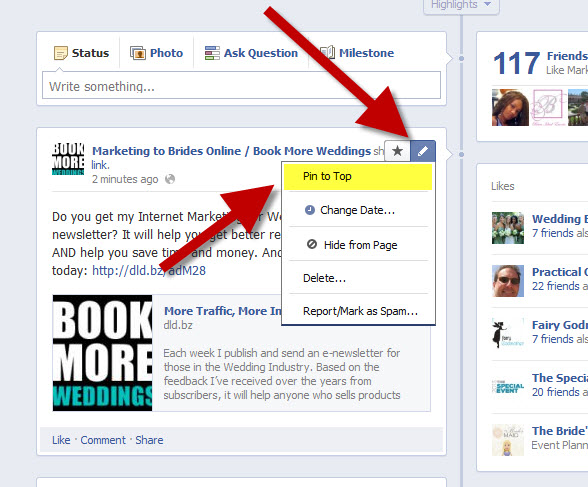
This helps the flow of a Facebook user, which your scroll stopping Facebook cover photo attracted, to follow through and view your offer immediately beneath the cover photo after arriving at your page.
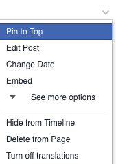
To pin a Facebook post: Simply publish the post to Facebook, then click the three dots on the top right corner of the post and choose "Pin to Top."
You also have the option of putting in a video for your Facebook cover photo too.
Post a Facebook cover video by saving a video file at 820 pixels wide by 426 pixels tall to your desktop. Open your Facebook Business page, click "Change Cover" at the top-left of your cover photo, and select "Upload Photo/Video." This allows you to format and publish the desktop file to your Facebook page.
Facebook accepts cover videos between 20 and 90 seconds long, and a minimum of 820 pixels wide by 312 pixels tall. The maximum (and recommended) size is 820 by 462 pixels with a video resolution of 1080p.
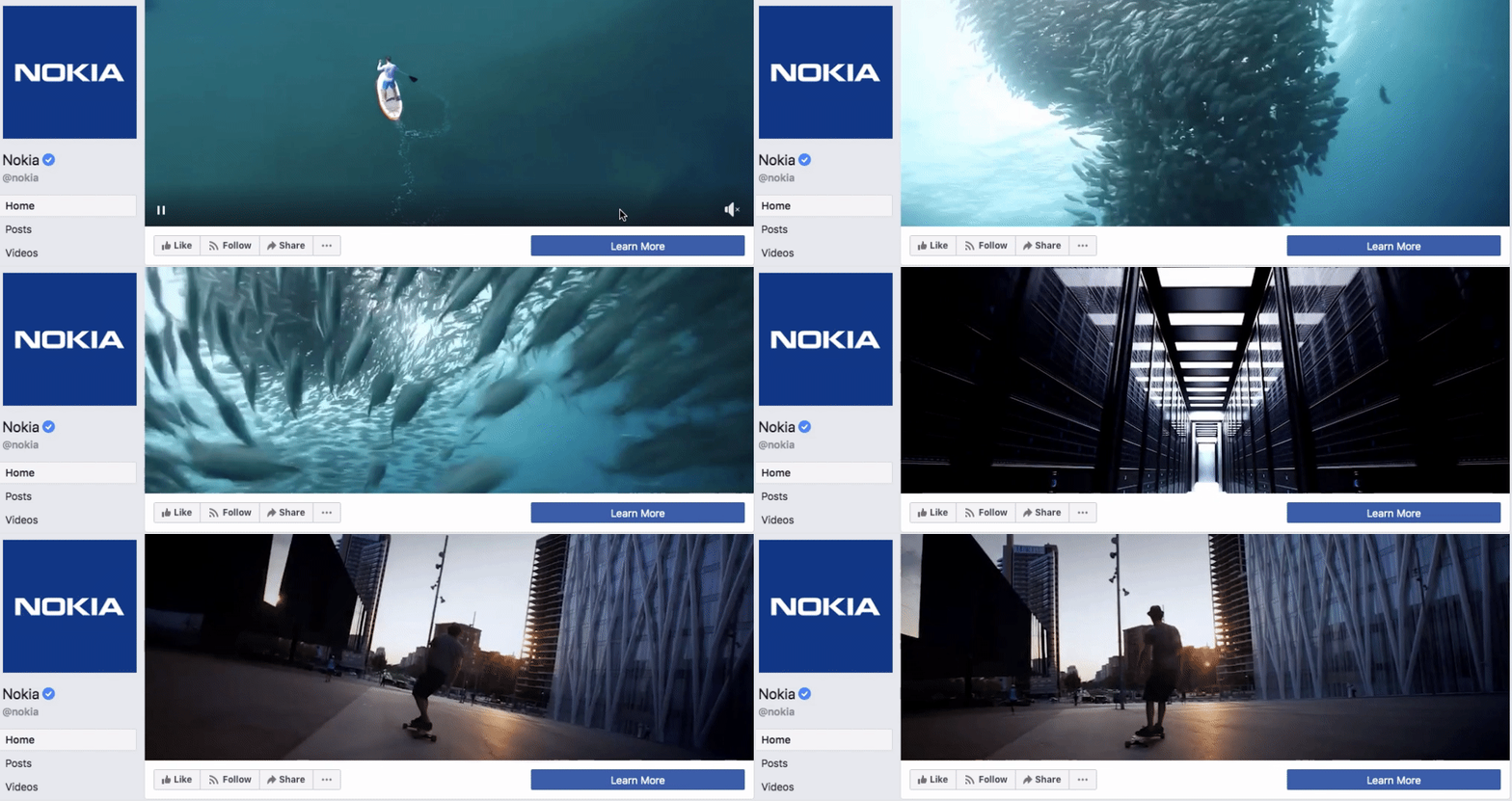
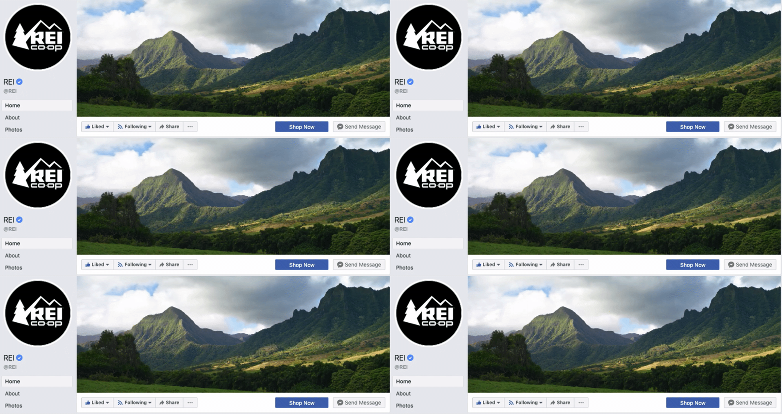
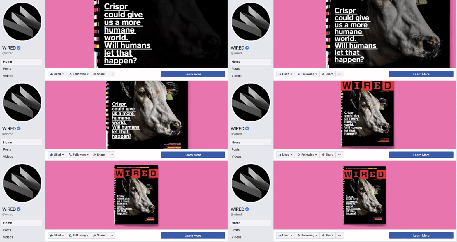
Here are some of my favorite Facebook cover videos:
Nokia
REI
HubSpot

I hope you enjoyed today's blog, (last blog was on Oracle partnering with TikTok)
Post your Facebook Business Page Cover Photo below!
. . .
Enjoyed this blog? Signup here to get updates on new startup blogs.
Is Facebook not explaining why they disapproved an ad?
I worked at FB for years and offer FB Policy Consulting here
Available for freelance writing and guest posting on your blog: [email protected]


