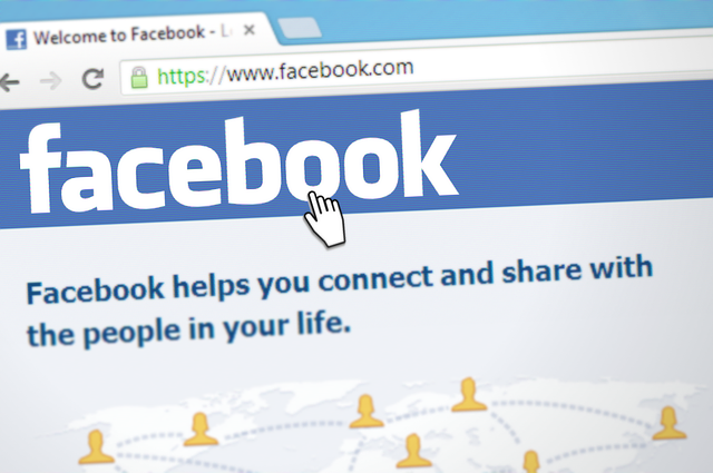
Have you jumped on board with one of the highest converting mediums for marketing yet? Video is king right now especially during the holiday season. [Read our last blog on HP moving to Texas here]
Video is number one for increasing engagement on social media platforms which also boosts brand awareness to help you end the year strong with increased profits.
Struggling with how to do this? We got you covered - Facebook just released 3 tips to help you improve your video marketing.
1. "Add a 3-5 second trailer to hold interest" Facebook recommends adding a short preview of your video at the start of video clips. While this has been used frequently on YouTube it hasn't seen as much use on Facebook videos as a whole.
Essentially you'll want to paste a key snippet from your video and include in the beginning of the clip which helps to entice viewers to stick around and see what's next.
It's a short and sweet way to boost your engagement as well as increase the view time which helps you segregate retargeting campaigns per video view time.
Another deet Facebook mentioned is using the Creator Studio analytics to find out when you're losing viewers. Once you identify this, you can swap out blocks of content and add more exciting elements where you see folks dropping off. 2. "Frame the story - with a 4:5 aspect ratio" Because everyone is on their smartphones, Facebook recommends we should create videos that are vertical not horizontal.
"We live in a world were most people watch videos on mobile just inches from their face and often in vertical orientation rather than turning their phone to landscape. Try framing your visual story and build for vertical format. Editing your videos using a 4:5 aspect ratio may work best for your videos on Facebook."
Back at Facebook's research HQ they discovered some videos have seen a noticeable improvement in performance when switching from 19:9 orientation to 4:5.
3. "Engage your community - commenting on posts" Facebook leaves us with one last video tip: increase engagement by responding to comments on video posts.
It's such a simple thing to do but you'd be surprised how many businesses never reply to comments on their videos. When you reply, customers feel included, and it builds brand loyalty as well.
If you can't find the time to do so, hire a social media manager to post on your social media pages and reply to the comments.
Facebook clarifies this further:
"Joining the conversation in the comments section of your own posts can delight your audience and maximize your reach. Longer comments, like sharing your own perspective on the discussion or answering questions, can spark even more engagement with your content." Facebook also says you can reply to Facebook and Instagram video comments through the Inbox tab in Creator Studio, which some find easier to manage their activity from.
Also, Facebook has shared 5 pretty general tips for video creation:
Clearly these are pretty basic tips, you want to get your content creation strategy well defined too. Make sure to switch up the type of content to keep it interesting.
You can read Facebook's full set of video tips here. What is a challenge you face with posting videos on Facebook?
Comment below! Facebook disapprove your ad and won't tell you why?Need done-for-you FB ads? Schedule a time to talk to someone who worked at Facebook here.
. . .
Enjoyed this blog? Signup here to get updates on new startup blogs.
Need done-for-you Facebook marketing? Book a call with me here.
Is Facebook not explaining why they disapproved an ad?
I worked at FB for years and offer FB Policy Consulting here
Available for freelance writing and guest posting on your blog: [email protected]
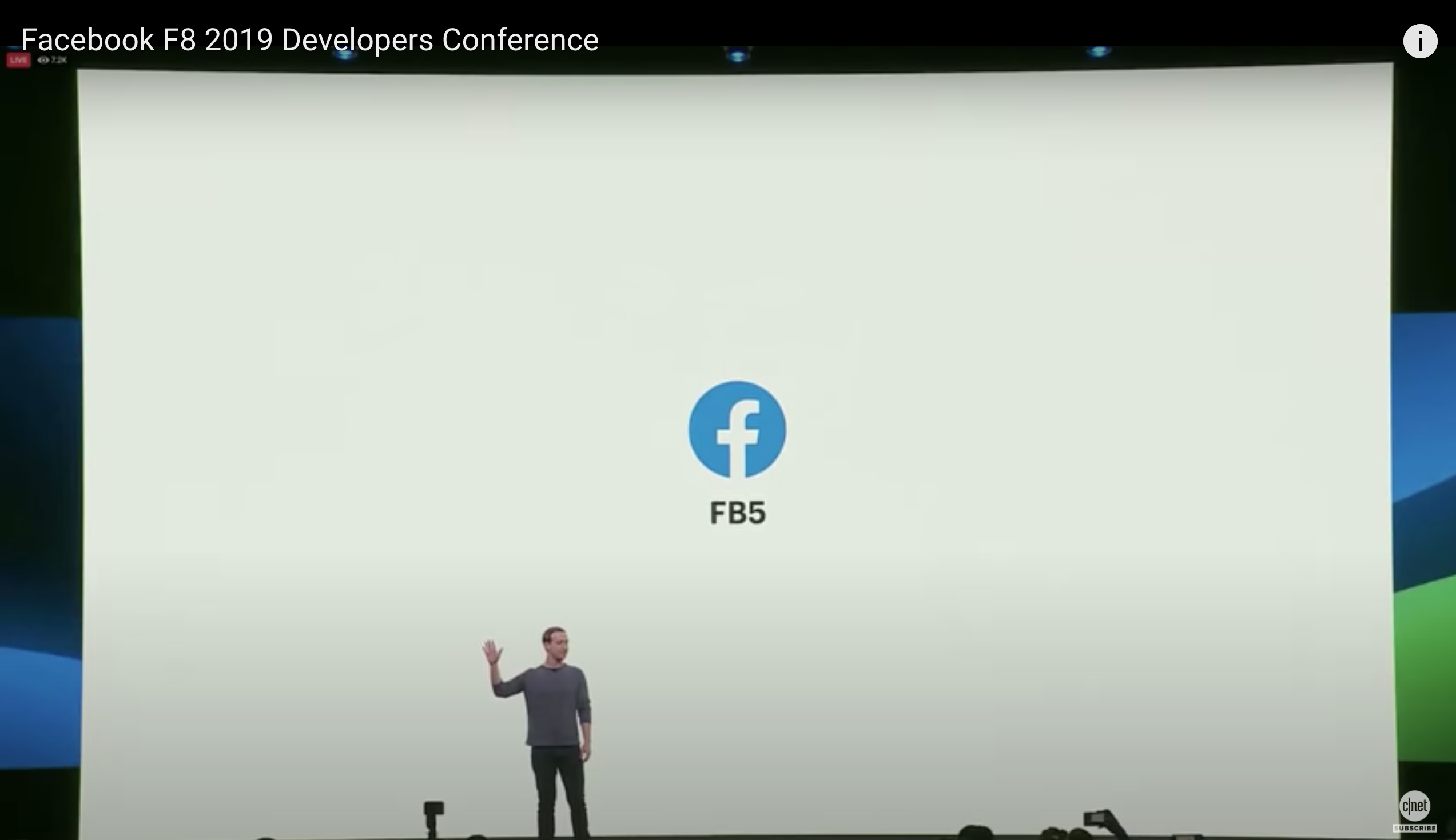
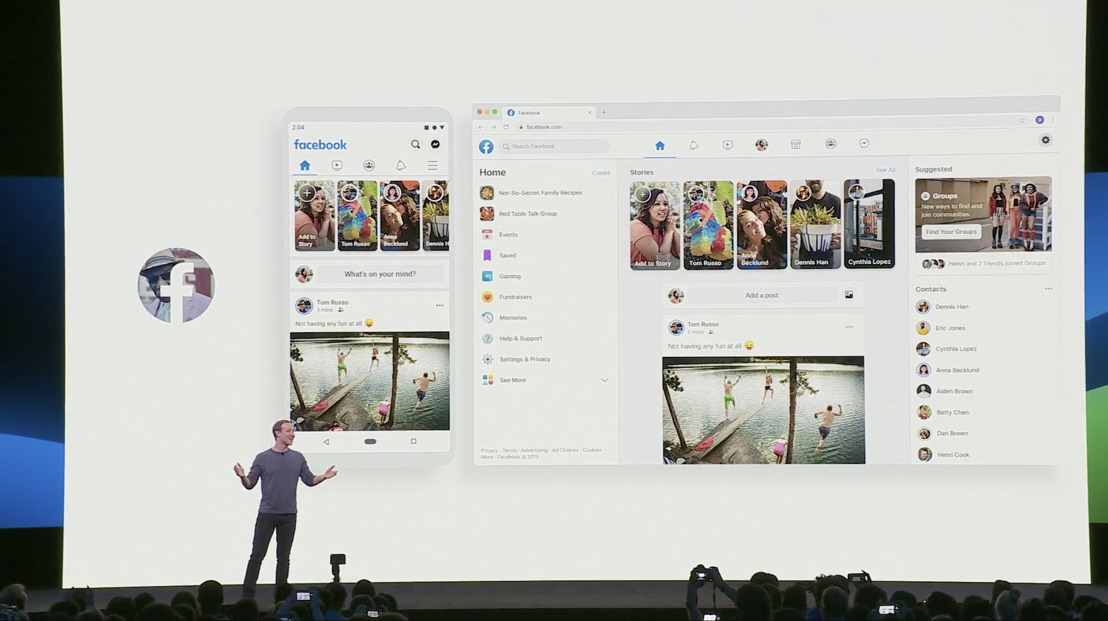
Facebook just rolled out the mandatory new Facebook design for their platform and many people hate it.
Facebook CEO Mark Zuckerberg announced during the 2019 annual F8 Developer’s conference (@ 26:52) that Facebook is getting a massive redesign “to make Facebook easier to navigate.”
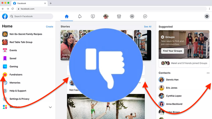
The new Facebook design “FB5” has a lot of white space everywhere and is intended to have a greater emphasis on Groups and Events. This means the Facebook News Feed will be less front-and-center.
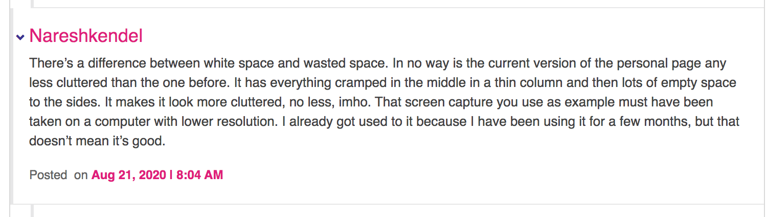
You can have white space without having wasted space and everything scrunched up in the center.
But…it is supposed to reduce clutter?
The new design while saying that it’s made to reduce clutter, in fact actually makes everything look 10X more cluttered due to exaggerated ratios of white space between icons, News Feed, Messenger and more.
It's one thing to make a website more secure, but it's quite another to add increased time for scrolling for the same amount of info due to how far apart everything is space and of course additional lag time.
Mark Zuckerberg’s intention is to restore the public’s trust in Facebook by ensuring that Facebook users have greater protection of their privacy but at what cost? If Facebook isn't fun & easy to use aesthetically, Mark is taking the big L.
Steve Jobs had a near genius level gift for aesthetic design, which is why Apple is one of the most popular companies for mobile phones and computers.
The popularity of iPhones and MacBooks isn’t just about their content, it’s in the sleek design that makes them easy to use as well as simply looking nice sitting on your bedside nightstand or coffee table.
MacBooks are notoriously harder to break into for viruses than Windows computers which adds to their appeal.
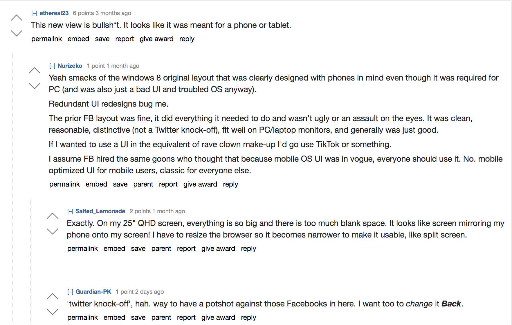
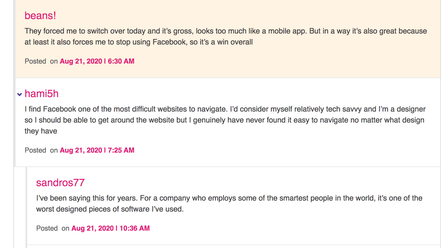
But, back to aesthetics - on this reddit post many users who are software engineers and gamers who use large computer monitors at home report on the challenges the new design presents:
The reality is, despite fans of the new Facebook design saying that it's geared towards younger people who are on their smartphones more, there are plenty of young people who are gamers.
From 8 year olds to 20 somethings, gaming - especially during Covid shut downs and stay-at-home orders - is a huge industry with millions of people actively gaming every day.
Gamers use large monitors for their daily internet tasks, as everyone else who is working from home right now may also use from 19 inch monitors on the small side to 62 inches on the larger side.
So what is the motivation for angering millions of people here and making a new Facebook design that is a copycat of Twitter?
Zuck has 6 components he wants Facebook to follow with the new design and going forward into the future for Facebook post 2020:
1. Private interactions - simple intimate spaces where you have clear control over who you’re communicating with.
2. End-to-end encryption - to exclude even Facebook from seeing your conversations
3. Reduced permanence - that your data won’t be stored forever with Facebook internally and won’t use your stories and messages later to come back and hurt you.
4. Safety - Facebook is going to attempt to build safety in for the shift of the new Facebook design.
5. Interoperability - the ability to seamlessly transition from using one Facebook owned asset like Instagram to another like WhatsApp.
6. Secure data storage - that Facebook won’t store your sensitive data in countries where dictators can just command Facebook to reveal your info.
From my time working at Facebook I can share that keeping these promises is going to be 100 times harder than it sounds.
Especially the reduced permanence.
There are so many rabbit holes with saved and cached data, and old files that I seriously doubt Facebook can honor that promise.
New access rules are coded into the new Facebook design to automatically flag perceived security threats as you use Facebook.
This brings into question, how many times will you be accidentally - or permanently - locked out of your Facebook Profile because of a glitch in the automations?
Many Facebook users know what I'm talking about, having to present their driver's license to a panel of strangers just to access their Facebook profile. Or marketers who get locked out of their ad account because of false flags.
Also Facebook’s new Lightspeed project for making Facebook Messenger faster - all of this sounds nice in theory but it appears like Facebook didn’t survey their users to find out what people actually like.
Welcome to the new FB5:
There’s a way to code privacy into a new design without losing the features of the existing design that people everywhere know, like and love.
Comments from an article by The Verge echo this sentiment:
It appears the Facebook engineers are copying Twitter’s design - but again, if Facebook users wanted a mobile website design they would open their phones. It isn’t enjoyable to use a mobile website on your desktop. Critique on this reddit thread includes: “There are UI/UX rules and patterns for every platform. These "redesigns" are blatantly slapping mobile UX on desktop and decimating efficiency, which is what desktop is about.” And “also it hardly shows any posts from pages. I shouldn't have to click on each individual page I follow to see their posts. That's a complete waste of time.” The comments many made while humorous also pointed out design flaws: “Is that why literally everyone hates these new bubbly huge shit designs ? They found out what? that straight corners are too oppressive? That decently sized buttons and texts are blindophobic? Enjoy your non oppressive bubbles and kid design…” Literally everyone I know hates this design. Everyone. Why didn't Facebook do beta tests first and survey the people actually using the platform?
Determining if this design literally drives people off the platform to Facebook's competitors should have been numero uno on the to-do list before forcing everyone to roll out to a new design. The problem is simple: giant icons make it harder to digest content on the Newsfeed. It's a big picture book instead of People Magazine with pictures and text. Facebook isn't Instagram. There are separate demographics for each platform even if Facebook owns both. While I’m sure, given a year or so, we will all adapt and get used to the new design and maybe even reverse our opinions (I won’t though), there are important draw backs to note in the new design that even getting used to using won’t compensate for the loss of business revenue when folks leave Facebook due to decreased ease-of-use. This is what I wrote Facebook when they still offered the option to switch back to the original design and asked me why I wanted to switch: “The current design was working great - I could look and skim and click on what interests me."
"When you add extra scrolling to see the same info this increases obstacles to getting to the end result - content I like and enjoy that builds connections and keeps me on the platform.” “I don't have the patience and neither does anyone else, to have to scroll for a longer period of time just to see 5 posts and determine if they interest me."
"It's like running an ad to a landing page and asking people to fill out a 50 question survey just to get a free ebook.” “Not going to happen. The average attention span of someone is short, you have about 3 seconds to grab their attention at the start of an ad. It takes A LOT more than 3 seconds to see the same amount of posts - you are reducing the content consumable on Facebook for Facebook users by doing this.” Needless to say, Facebook never replied and continued the roll out - which if spaced over 6 months maybe would have been more digestible instead of spaced over 2 months. My critique is when you introduce more barriers between what people want (eg. content, connections, viewing their friends and liked Pages info) you reduce conversion rates for ads run on Facebook and people staying on Facebook. So many people dislike the new design that there is even a Chrome plug in to trick Facebook into thinking you’re using an older browser and force it to revert to the original design. Chrome Plug in for Regular Facebook Design called “Old Layout:”
https://chrome.google.com/webstore/detail/old-layout-for-facebook/abmkkackbbimmdbfjdilpnfaegaeagge Also Revert Site offers a plug in to get you back your original Facebook here too: https://chrome.google.com/webstore/detail/revert-site/cdnkbhnblhjdjifeibckehifjocllaja Also this plug in:
https://chrome.google.com/webstore/detail/switch-to-classic-design/oancckmjgaoejmbedngcoiakblhacbog Lifehacker’s article goes into a few details about it that I mention above too. Old Facebook design For Mozilla Firefox users: https://addons.mozilla.org/en-US/firefox/addon/old-layout-for-facebook/ Lastly there’s a User Agent Switch plug in that’s supposed to work pretty well too: https://chrome.google.com/webstore/detail/user-agent-switcher/kchfmpdcejfkipopnolndinkeoipnoia/related This might end up being just a temporary fix. Facebook changes their settings often and there could be a change coming that will the plugins from working. It’s possible that Facebook features could be missing. The plugins can alter how the page is displayed, but they can’t restore features that Facebook might have disabled on their end. I’m using the Old Layout Chrome plug in and so far everything looks fine. Please review the permissions required for the plugins. I’m not BFFs with the plugin authors, so I can’t personally vouch for the security of the underlying code. What do you think of the new Facebook design, FB5? Comment below!
. . .
Enjoyed this blog? Signup here to get updates on new startup blogs.
Is Facebook not explaining why they disapproved an ad?
I worked at FB for years and offer FB Policy Consulting here
Available for freelance writing and guest posting on your blog: [email protected]
1. Make Sure to Follow Facebook's Rules for Facebook Pages Make sure you have Facebook guidelines bookmarked and review them before creating your Facebook cover. Breaking these rules can result in your whole Page being taken down - which would be a bit silly when you explain to your clients that you aren't able to advertise for them because of your Facebook cover photo. So know them and follow em! 2. Facebook Cover Photo Size: 820 Pixels Wide By 312 Pixels Tall On Desktop So you spent an hour designing the perfect Facebook Cover Photo and then you go to upload it but your killer CTA line is cut off. Shucks! All of that could have been prevented by just getting the right dimensions. If you upload an image smaller than 820 Pixels Wide By 312 Pixels, Facebook will stretch it to fit the right size which can distort your image and we don't want that. If you want to avoid the hassle of resizing your cover photos you can just use one of these handy templates, and it's ready-set-go: Canva FB Cover Photo Template
Poster My Wall FB Cover Template To be honest, sometimes you just have to mess with it until the picture fits, if you aren't using the templates. For example, my ecommerce store cover photo fits perfectly but isn't the Facebook standard dimensions for cover photos, it's 2232 × 822:
3. Keep Your Cover Photo Visually Striking Not Busy
If you've ever seen a photo with a lot of things going on in it, you know that it's like a visual representation of a head ache. No one wants all that going on!
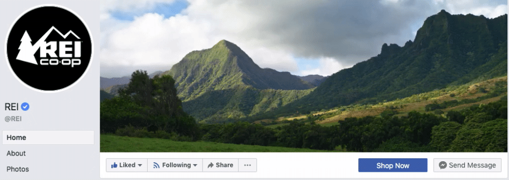
Keep that text concise, and images simple with clean lines and primary color contrasts. Use 1, maximum 2 info graphics. Here are few Facebook Cover Photos that really work:
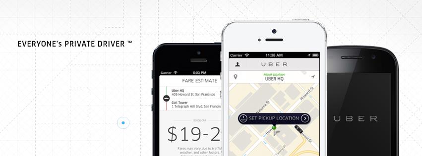
Here you can see Uber has identified their target audience - consumers who need a driver, pointed out how they can book a driver with a smartphone image of their app, and created a visually striking contrast between the black and white colors.
The map grid in the background is almost a subtle unconscious influence to get you thinking about where you want to go using their ride share service.
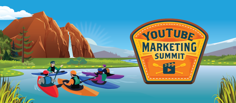
Social Media Examiner is using their Facebook Cover photo to advertise their upcoming YouTube marketing summit. You have their summit's name just to the right, with brand colors present and kayakers symbolizing the teacher-student relationship - very well done!
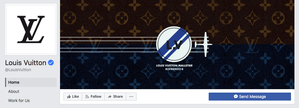
Last but not least, luxury brand Louis Vuitton has an elegant yet simple design of motion going from left to right as most people read, from an airplane that may symbolize a private jet from the upper echelons of the financial earners:
4.Keep Your Audience In Mind
You want to instantly strike a chord with your target audience, and while it's fun to get creative, don't get carried away. Keep your intentions in line with your brand colors and cover photo.
Social media accounts are extensions of your business - this is your digital store front. So you want a call to action, and a message to speak to your target audience. 5. Make Sure Your Cover Photo is Mobile-Friendly
Look at any metrics for ads and you'll see more and more people are viewing Facebook ads on their smart phones than on a laptop or desktop computer.
If your cover photo is beautifully designed, but looks janky on mobile, you've just lost a sale. So do the work and make sure your cover photo is optimized for mobile too.
Your cover photo displays at 820 pixels wide by 312 pixels tall on desktop, it displays only the center 640 pixels wide by 360 pixels tall on smartphones. Take a look at this Facebook help document for more information.
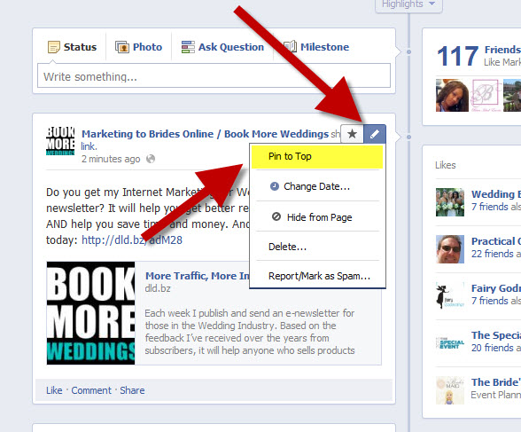
6. Use A Pinned Post As a CTA That Matches Your Cover Photo
This a nice little hack: pin a post that matches your cover photo's brand colors and message:
This helps the flow of a Facebook user, which your scroll stopping Facebook cover photo attracted, to follow through and view your offer immediately beneath the cover photo after arriving at your page.
To pin a Facebook post: Simply publish the post to Facebook, then click the three dots on the top right corner of the post and choose "Pin to Top."
7. Facebook Cover Videos You also have the option of putting in a video for your Facebook cover photo too.
Post a Facebook cover video by saving a video file at 820 pixels wide by 426 pixels tall to your desktop. Open your Facebook Business page, click "Change Cover" at the top-left of your cover photo, and select "Upload Photo/Video." This allows you to format and publish the desktop file to your Facebook page.
Facebook accepts cover videos between 20 and 90 seconds long, and a minimum of 820 pixels wide by 312 pixels tall. The maximum (and recommended) size is 820 by 462 pixels with a video resolution of 1080p.
Here are some of my favorite Facebook cover videos: