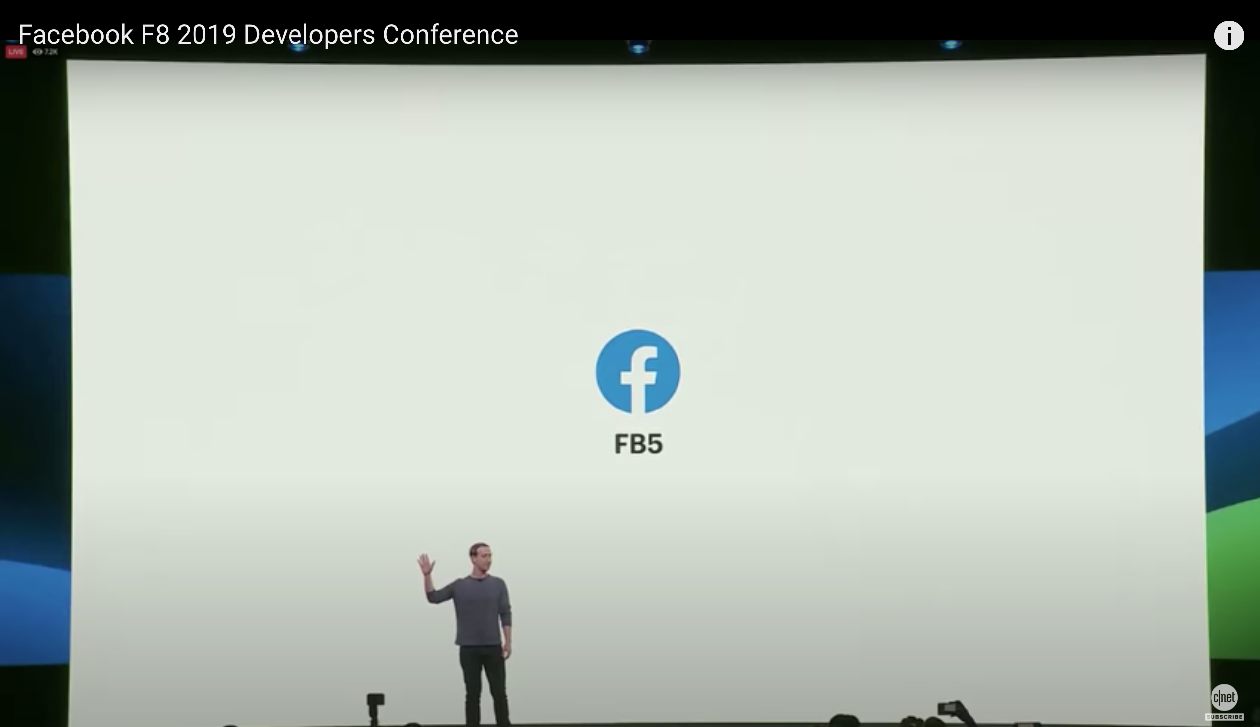
Facebook just rolled out the mandatory new Facebook design for their platform and many people hate it.
Facebook CEO Mark Zuckerberg announced during the 2019 annual F8 Developer’s conference (@ 26:52) that Facebook is getting a massive redesign “to make Facebook easier to navigate.”
(F8 Cliffnotes here)
The new Facebook design “FB5” has a lot of white space everywhere and is intended to have a greater emphasis on Groups and Events. This means the Facebook News Feed will be less front-and-center.
You can have white space without having wasted space and everything scrunched up in the center.
But…it is supposed to reduce clutter?
The new design while saying that it’s made to reduce clutter, in fact actually makes everything look 10X more cluttered due to exaggerated ratios of white space between icons, News Feed, Messenger and more.
It's one thing to make a website more secure, but it's quite another to add increased time for scrolling for the same amount of info due to how far apart everything is space and of course additional lag time.
Can Google Duplex order me a new Facebook?
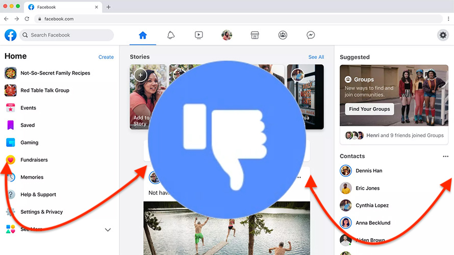
Credit Ad Week
Mark Zuckerberg’s intention is to restore the public’s trust in Facebook by ensuring that Facebook users have greater protection of their privacy but at what cost? If Facebook isn't fun & easy to use aesthetically, Mark is taking the big L.
Steve Jobs had a near genius level gift for aesthetic design, which is why Apple is one of the most popular companies for mobile phones and computers.
The popularity of iPhones and MacBooks isn’t just about their content, it’s in the sleek design that makes them easy to use as well as simply looking nice sitting on your bedside nightstand or coffee table.
MacBooks are notoriously harder to break into for viruses than Windows computers which adds to their appeal.
But, back to aesthetics - on this reddit post many users who are software engineers and gamers who use large computer monitors at home report on the challenges the new design presents:
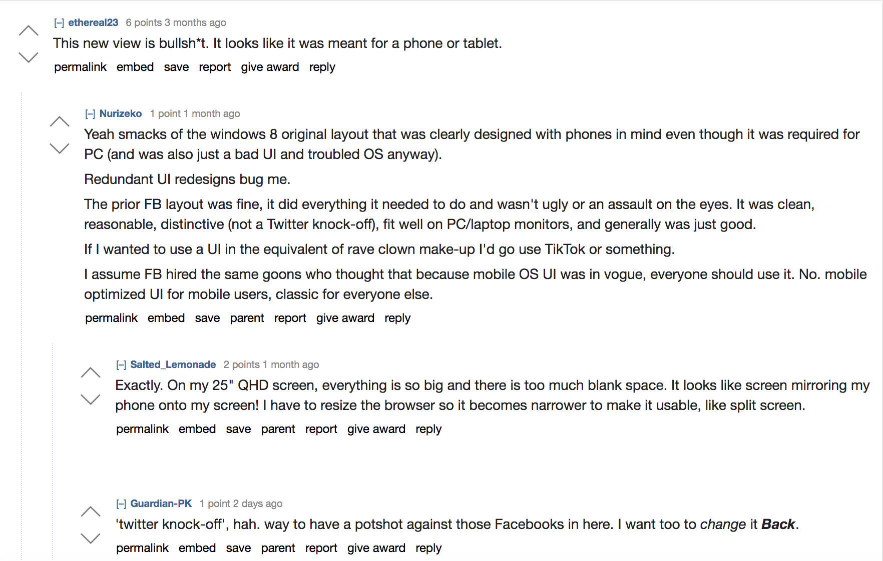
The reality is, despite fans of the new Facebook design saying that it's geared towards younger people who are on their smartphones more, there are plenty of young people who are gamers.
From 8 year olds to 20 somethings, gaming - especially during Covid shut downs and stay-at-home orders - is a huge industry with millions of people actively gaming every day.
Gamers use large monitors for their daily internet tasks, as everyone else who is working from home right now may also use from 19 inch monitors on the small side to 62 inches on the larger side.
So what is the motivation for angering millions of people here and making a new Facebook design that is a copycat of Twitter?
Zuck has 6 components he wants Facebook to follow with the new design and going forward into the future for Facebook post 2020:
1. Private interactions - simple intimate spaces where you have clear control over who you’re communicating with.
2. End-to-end encryption - to exclude even Facebook from seeing your conversations
3. Reduced permanence - that your data won’t be stored forever with Facebook internally and won’t use your stories and messages later to come back and hurt you.
4. Safety - Facebook is going to attempt to build safety in for the shift of the new Facebook design.
5. Interoperability - the ability to seamlessly transition from using one Facebook owned asset like Instagram to another like WhatsApp.
6. Secure data storage - that Facebook won’t store your sensitive data in countries where dictators can just command Facebook to reveal your info.
From my time working at Facebook I can share that keeping these promises is going to be 100 times harder than it sounds.
Especially the reduced permanence.
There are so many rabbit holes with saved and cached data, and old files that I seriously doubt Facebook can honor that promise.
New access rules are coded into the new Facebook design to automatically flag perceived security threats as you use Facebook.
This brings into question, how many times will you be accidentally - or permanently - locked out of your Facebook Profile because of a glitch in the automations?
Many Facebook users know what I'm talking about, having to present their driver's license to a panel of strangers just to access their Facebook profile. Or marketers who get locked out of their ad account because of false flags.
Also Facebook’s new Lightspeed project for making Facebook Messenger faster - all of this sounds nice in theory but it appears like Facebook didn’t survey their users to find out what people actually like.
Welcome to the new FB5:
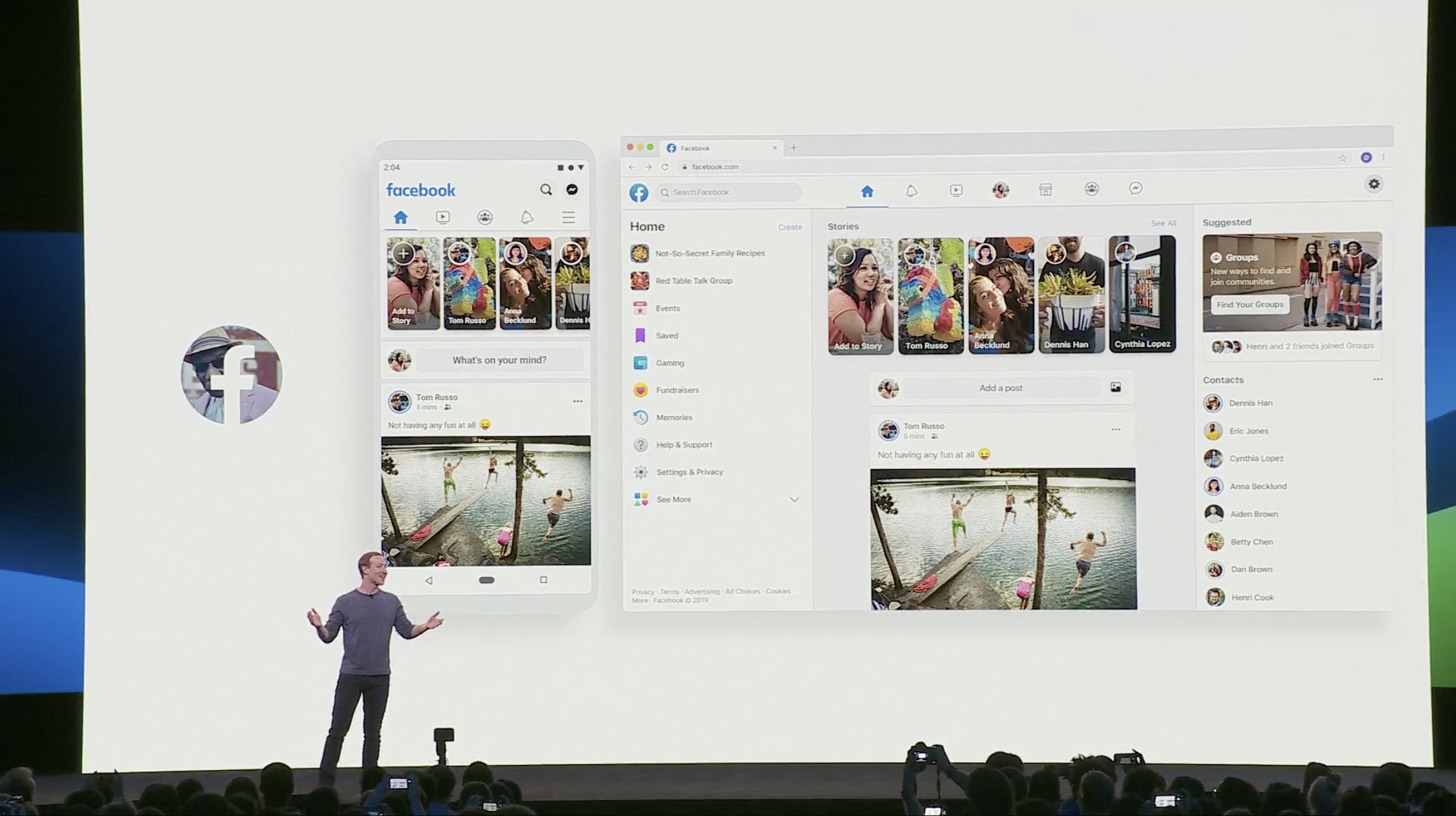
There’s a way to code privacy into a new design without losing the features of the existing design that people everywhere know, like and love.
Comments from an article by The Verge echo this sentiment:
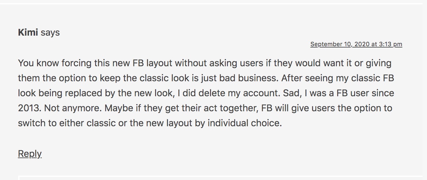
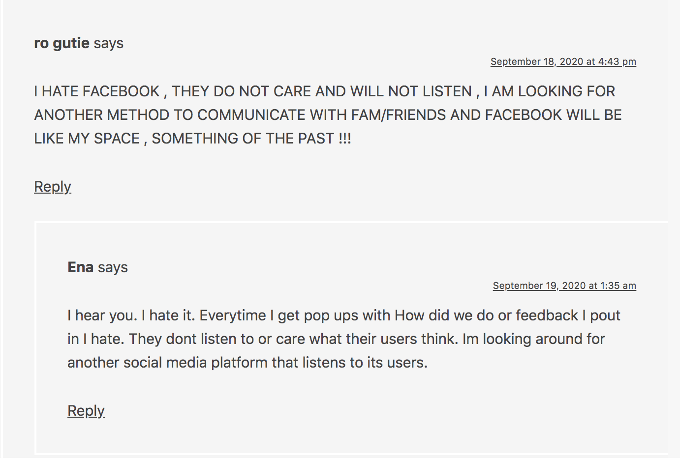
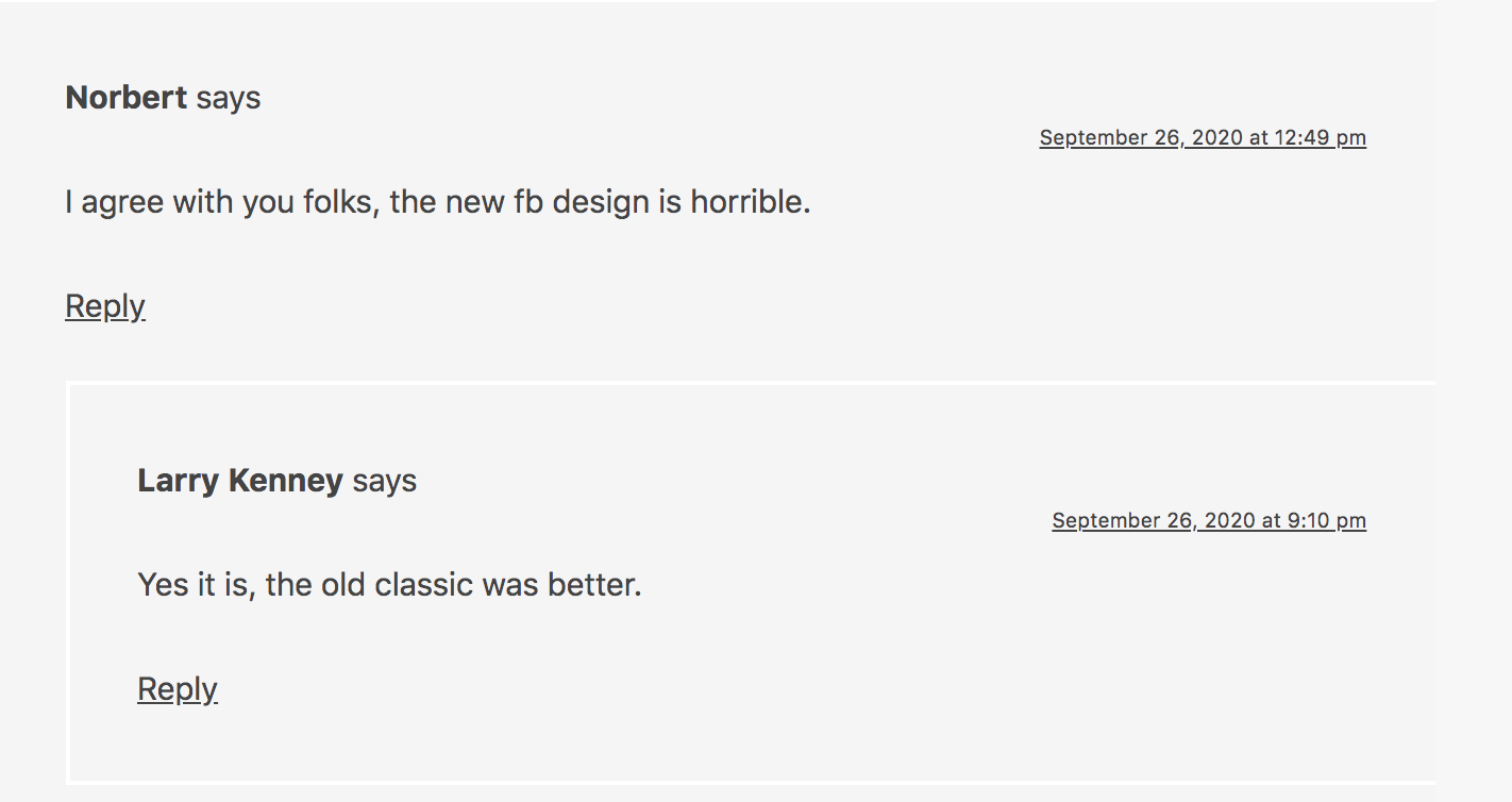

The Search Engine Journal (SEJ)reported on this as well:
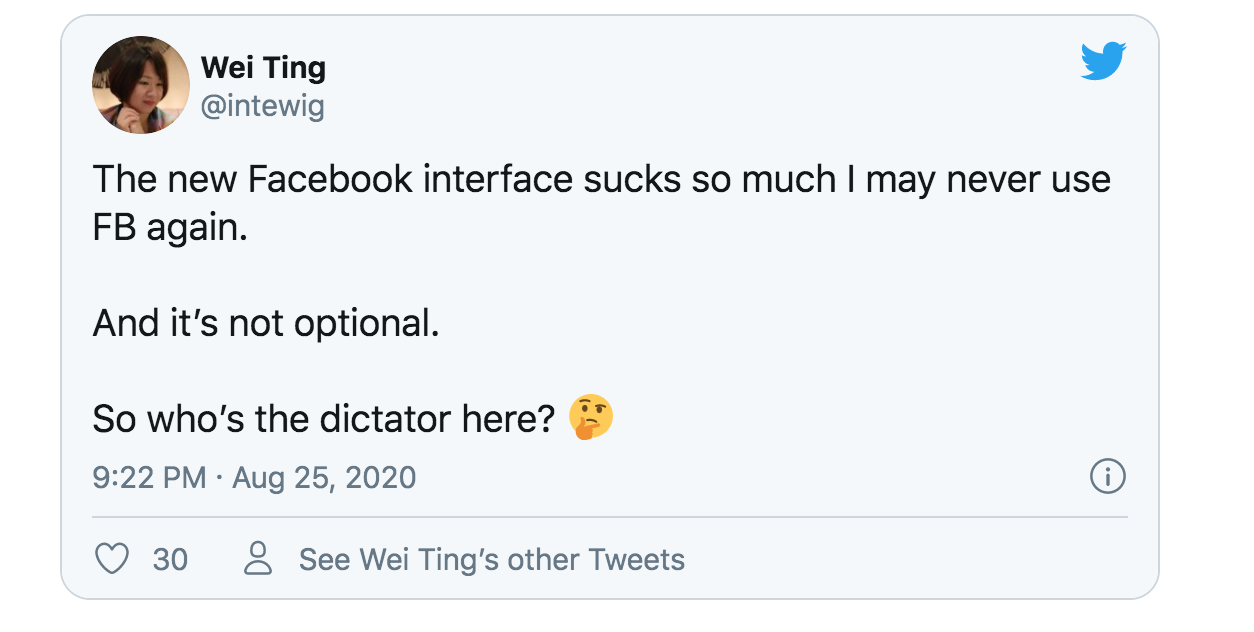
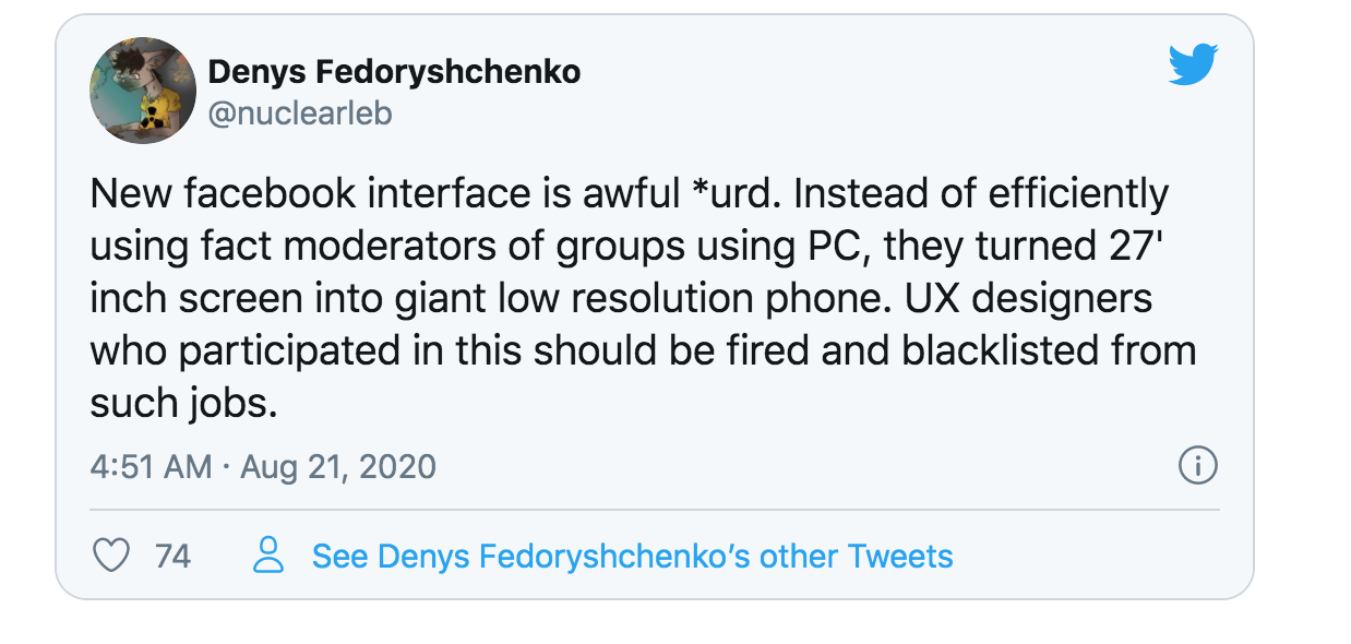
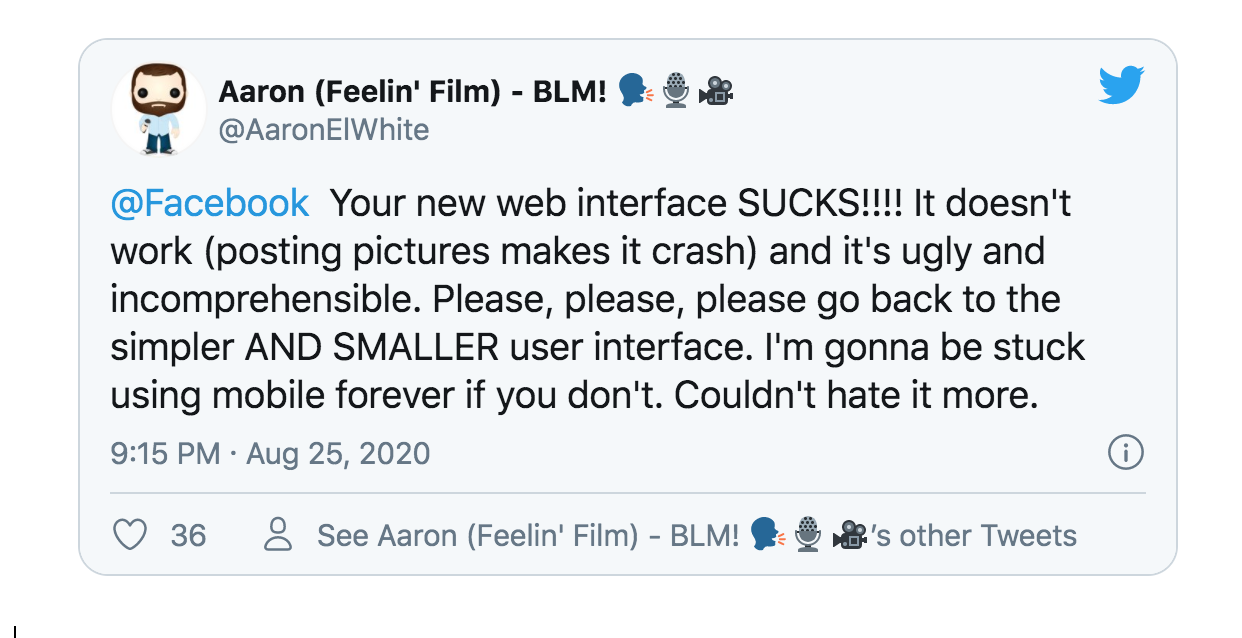

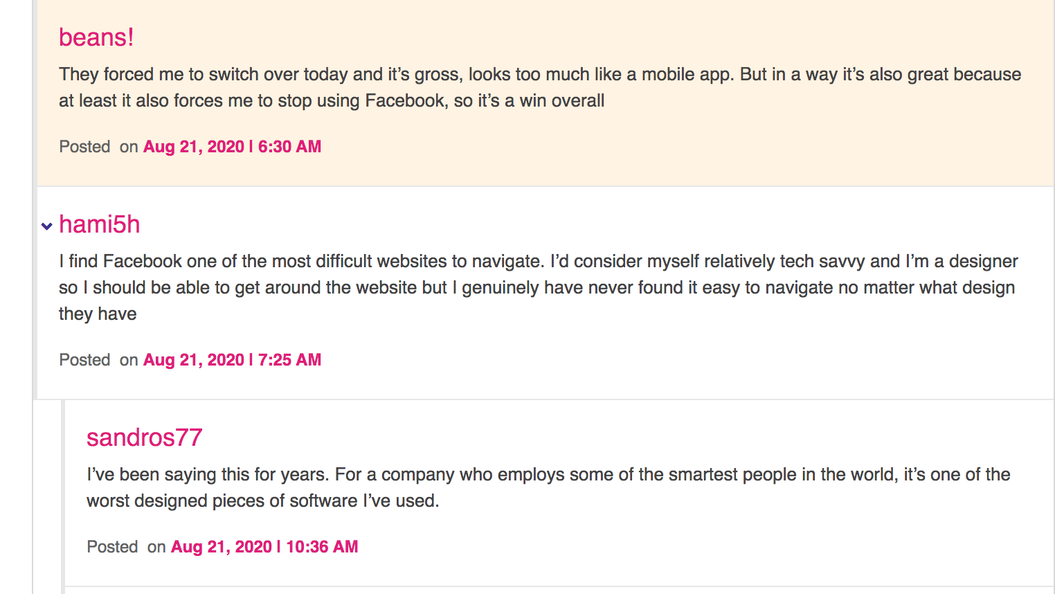

It appears the Facebook engineers are copying Twitter’s design - but again, if Facebook users wanted a mobile website design they would open their phones. It isn’t enjoyable to use a mobile website on your desktop.
Critique on this reddit thread includes: “There are UI/UX rules and patterns for every platform. These "redesigns" are blatantly slapping mobile UX on desktop and decimating efficiency, which is what desktop is about.”
And “also it hardly shows any posts from pages. I shouldn't have to click on each individual page I follow to see their posts. That's a complete waste of time.”
The comments many made while humorous also pointed out design flaws:
“Is that why literally everyone hates these new bubbly huge shit designs ? They found out what? that straight corners are too oppressive? That decently sized buttons and texts are blindophobic? Enjoy your non oppressive bubbles and kid design…”
Literally everyone I know hates this design. Everyone. Why didn't Facebook do beta tests first and survey the people actually using the platform?
Determining if this design literally drives people off the platform to Facebook's competitors should have been numero uno on the to-do list before forcing everyone to roll out to a new design.
The problem is simple: giant icons make it harder to digest content on the Newsfeed. It's a big picture book instead of People Magazine with pictures and text. Facebook isn't Instagram. There are separate demographics for each platform even if Facebook owns both.
While I’m sure, given a year or so, we will all adapt and get used to the new design and maybe even reverse our opinions (I won’t though), there are important draw backs to note in the new design that even getting used to using won’t compensate for the loss of business revenue when folks leave Facebook due to decreased ease-of-use.
This is what I wrote Facebook when they still offered the option to switch back to the original design and asked me why I wanted to switch:
“The current design was working great - I could look and skim and click on what interests me."
"When you add extra scrolling to see the same info this increases obstacles to getting to the end result - content I like and enjoy that builds connections and keeps me on the platform.”
“I don't have the patience and neither does anyone else, to have to scroll for a longer period of time just to see 5 posts and determine if they interest me."
"It's like running an ad to a landing page and asking people to fill out a 50 question survey just to get a free ebook.”
“Not going to happen. The average attention span of someone is short, you have about 3 seconds to grab their attention at the start of an ad. It takes A LOT more than 3 seconds to see the same amount of posts - you are reducing the content consumable on Facebook for Facebook users by doing this.”
Needless to say, Facebook never replied and continued the roll out - which if spaced over 6 months maybe would have been more digestible instead of spaced over 2 months.
My critique is when you introduce more barriers between what people want (eg. content, connections, viewing their friends and liked Pages info) you reduce conversion rates for ads run on Facebook and people staying on Facebook.
So many people dislike the new design that there is even a Chrome plug in to trick Facebook into thinking you’re using an older browser and force it to revert to the original design.
Chrome Plug in for Regular Facebook Design called “Old Layout:”
https://chrome.google.com/webstore/detail/old-layout-for-facebook/abmkkackbbimmdbfjdilpnfaegaeagge
Also Revert Site offers a plug in to get you back your original Facebook here too:
https://chrome.google.com/webstore/detail/revert-site/cdnkbhnblhjdjifeibckehifjocllaja
Also this plug in:
https://chrome.google.com/webstore/detail/switch-to-classic-design/oancckmjgaoejmbedngcoiakblhacbog
Lifehacker’s article goes into a few details about it that I mention above too.
Old Facebook design For Mozilla Firefox users:
https://addons.mozilla.org/en-US/firefox/addon/old-layout-for-facebook/
Lastly there’s a User Agent Switch plug in that’s supposed to work pretty well too:
https://chrome.google.com/webstore/detail/user-agent-switcher/kchfmpdcejfkipopnolndinkeoipnoia/related
This might end up being just a temporary fix. Facebook changes their settings often and there could be a change coming that will the plugins from working.
It’s possible that Facebook features could be missing. The plugins can alter how the page is displayed, but they can’t restore features that Facebook might have disabled on their end.
I’m using the Old Layout Chrome plug in and so far everything looks fine.
Please review the permissions required for the plugins. I’m not BFFs with the plugin authors, so I can’t personally vouch for the security of the underlying code.
What do you think of the new Facebook design, FB5? Comment below!
. . .
Enjoyed this blog? Signup here to get updates on new startup blogs.
Is Facebook not explaining why they disapproved an ad?
I worked at FB for years and offer FB Policy Consulting here
Available for freelance writing and guest posting on your blog: [email protected]



I use this extension -https://chrome.google.com/webstore/detail/switch-to-classic-design/oancckmjgaoejmbedngcoiakblhacbog
Thanks for the comment Dave, and the link to the Chrome extension. The one I mention in this article stopped working yesterday as Facebook updated their API once again